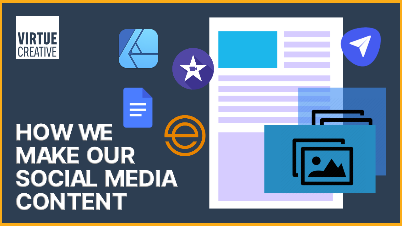
Playing around in webflow


Summary
In this episode, dad will take the reigns, do some playing around in the designer, test some of the topics we’ve covered, as well as complete some impromptu challenges i throw his way.
Watch Here
Listen Here
Weekly tips
There are three types of link settings
Padding increases the clickable area in burger menus
Add spacing quickly with shift and option
X-ray mode shows you where spacing has been added
Use auto margin to spread items in flexbox
Grids only accept one element per block
Transcript
Joseph: All right.
We're back for another episode. Is this episode four, five?
Joel: Dunno. It's a
Joseph: track. All right. It's either episode four or five. So in this episode, what we're going to do is just let you play around with stuff. So this is pre fin sweet learning. Just so we didn't add too many layers on.
So we're gonna open up the designer on your screen. Yeah, no pressure. You can just go through, pull stuff on screen, add some styles, ask questions, and we'll go from there.
Joel: Can I break anything? Is it possible during the day?
Joseph: I guess we'll find out. All right. So if you want to just delete everything on screen or you can leave it, I'd probably just leave it all. So you have a fresh canvas, so just
Joel: touch that. All right. So I do have control of the mouse. So that I guess is the first the first question and the keyboard here. Let's see. All right. I am believing stuff. Okay. I believe the body we leave, that's here to stay
Joseph: and that is permanently,
Joel: that is here to stay.
Okay. So I'm I'm gonna
Joseph: no pressure. Just start doing whatever you want. And
Joel: so my thing, my first thing I remember from my notes were command E I think brings up the shortcut tab. And I think I want to start, I want to bring in a diff block and that brings up our first dip block.
And I'm pretty sure that. You know what I'm just gonna play around him and bring in another one just for fun. And then since they're next to each other, they're on the same level that makes them siblings. Know, until I do something with them and all right. Ooh. All right. Now I haven't learned the fins suite naming convention yet, but I do know that we wanted the first thing that we're going to call this one is we're going to call it the page route.
I remember that from my notes. You certainly can't.
Joseph: You also don't need to build a page. You can just start going into the elements panel, grabbing stuff, pulling it on, but you can't follow a structure. The rains are yours, but don't feel obligated to try to repeat her. I try
Joel: to remember a few things just for fun.
So let's see if I either remember how to name something. Existing classes, he paid trapper. All right. So we're going to see if I will, we'll see later if I did that. Then interesting. So I don't remember the placing of the name so interesting. All right. Now the other thing I know that I, we definitely want to bring in is a is a nav bar.
So we're going to want to do want to bring in a navigation bar at some point in time, because that would be helpful. That's inside this one. That's cool. Interesting.
Let's just bring in some elements. Blocked. I want to move that inside. What's in here. Interesting in our brand, a little wheel of the little settings thing for our brand
Joseph: that, so the brand element currently is pretty much a link block. So that way, when you put your logo in it and you click it, it brings it back. So the settings tab, which you can click on it if you want opens up. So if you click that little
Oh, try going over to this next to the style panel, click the settings
Joel: over here.
Joseph: Yep.
Joel: Okay.
Joseph: So maybe you have to have, so you see the link setting options in there. This is where you could add links and stuff.
Joel: Okay. Yeah. All right. Okay. Interesting. All right. And then, okay, so then here we have our home. Oh, all so here I could add the home URL and then here's my about URL.
Joseph: So those buttons right there.
Yep. So that button, if you go back one that allows you to select which page it would like it to, so you can directly link it to a page. The first one allows you to go to just a random. And then as the third one, that anchor one, I think. Yes. So that is the anchor section. So right now, if you give one of your divs, an anchor thing, if you remember how to do that.
Joel: Yeah.
Joseph: So if you go and do that, it'll then pop up under the anchor setting.
Joel: Okay. All right.
And then a mail too. All right. A mail too, with the subject. All right. And okay. Phone. All right. That's good.
Joseph: So the menu button currently does not display. If you see right there in the settings, you could set which break point the menu button would appear. So in your middle, on the middle, that all the different icons that match your top bar. The middle down, sorry.
Yup. So if you slide that left one, it would then appear on this break point. That's right. Left, left other way. There you go. Okay. So that is just deciding where you'd want your burger menu displaying
from.
Joel: Gotcha. Alright.
Joseph: So it's to it's hidden, otherwise the element goat's hidden on the desktop setting
there you are tracking with you now, let's say I want to get rid of this white D block that's here.
Why is that? That is actually, I should just, so that's part of this page wrapper. So I need to like, just indent this whole thing inside the paid trapper, that part of the problem that this isn't inside the page, right?
There you go. Yup.
Joel: So that it wasn't inside of it. Huh. All right. So that's why there were space on top of that.
Yep.
Joseph: And so right now, when you don't, so this div block that you've got right underneath your navigation, it showing it as it's some type of height. If you were to go view this on a browser, there is no, there would've been no space above it or below your NAB navigator. That's just web flow, giving it some height just so you could click on it easier.
But right now it has zero height. So had you gone to preview mode? It wouldn't have been there. Yeah, it's just for so you can find it and see it right now on the screen.
Joel: Okay. Alrighty. Okay.
Joseph: So I'd be curious if you could curious, I'll give you a little challenge while we're here is if you can figure out how to center those buttons.
On the right, the home and about in contact. So they're at the same, they're centered with the Nessie image.
Joel: Okay. So they're centered top to bottom. Yes. Yep. Okay. Oh, alright. Interesting. Okay. So my, yes. And I'm just gonna I'm gonna talk myself through it. You don't have to answer right away. I'm just going to talk myself through it.
Okay. So my my guess would be to make this a top box, a flex box, and then realign it. But, so I'm going to, I'm going to try that. So I'm going to make this container can I make this container a flex box? Let's see, I don't even, it. Torah. Hey, there's tutorial on a flex box. Here's the word flex box.
Let's see what we can do. Flexbox Hey, that moved some stuff around. Hey, it's centered, but now it's way over here. We don't like that. Oh, I don't like that either. We only want, I don't want these over here. We still want them over here the way it should have been. So what we'd probably want to do is we want to add, do we want another, add another block?
Joseph: Actually, so you were pretty close on track. If you just keep looking at the settings you were playing around with. Okay.
Joel: Ooh. Interesting. Oh, split it now. Oh
Joseph: so that is the correct answer. So there is an interesting, there's an interesting thing with Flexbox and it's auto spread. So there's two ways to do it. If you now grab the nav menu.
Joel: All right. The nav menu nav. Okay. All
Joseph: right. So now on the, I can't remember, I think it's margin on the left margin side, quick physio.
Joel: Where am I at
Joseph: the left margin side?
Joel: Left margin.
Joseph: Click that
Joel: click and hold.
Joseph: No, just click it and
click auto.
Joel: Okay.
Joseph: There you go. Oh, wow. So it is telling it so right now they're not really sure how much stuff. They're supposed to take up. So that auto margin is telling it to put as much margin on the left side that it will take up.
So that margin auto. So sometimes when you're imagine you're building like a card with like employees, so you start with their photo and they've got a little bio and on the very bottom, it says contact. So if you had people's bios, one was two, two lines and one was four lines. The button would not stay level on the bottom.
So what you do is you turn the whole thing into a flex box and on the button, you click auto and it'll automatically push the button to the very bottom so that everything looks consistent all the way through. So when you're using flex box, keep in mind that auto comes in really handy. It's always worth trying that for your spacing stuff, but very good.
Yeah, you got that. Turned out really well. All right. So one more challenge now. It'd be interesting to see you add spacing to the next. Area so that the Nessie image is not all the way at the top of the website.
Joel: Okay. All right. All right. So that, so the gray area is there's additional gray area above the se image is what you're saying.
Yes. Okay. All right. Okay. I think we can I think we can manage that. So I think I would just want some additional panning that should be pretty simple, but then I think we would want some additional padding at the bottom of this as well, because that would look ugly if it wasn't.
Joseph: So you if you hit that either the shift or the alter command key, I think maybe the alt key while you're dragging it.
Joel: Okay.
Joseph: So it will do both of them. So there's one of the settings you can try where it does both. Okay.
There you go.
Joel: Okay.
Joseph: All right. So one, one other thing was, we're going to get a little picky here, even though we didn't fully learn it, but we will always want to use REMS, not pixels. So if you click now, one of those, you can do two things.
You can either go over to the rent thing and quick REM, and now it's gonna be crazy because it's still taking the previous value. So you can now REO. So now you can change it to whatever you'd want, and then you'll have to hope you have to regrab that
nav.
Joel: All right.
Joseph: You don't have to regrab the navigator got selected off the element. Oh yeah. And then you'll want to change the bottom one also. So you can now hit, but you don't have to go in now you can hit the command option on the top one
and it will automatically adjust the bottom on to that rep.
Joel: Alright to around.
Joseph: So now you keep selecting off the elements, so you can just hit enter. You don't have to click anywhere. It's like now let's adjust the bottom on just type into room and the bottom line. I just want to make sure you're not kick clicking off the element like you just did again. So after you type in it, yeah, just had to REM and enter.
Joel: It does nothing for me. Pending enter tab. I can tab through them.
Joseph: Are you clicked in, are you actually clicked on that quickly? There you go. Now hit enter.
Okay. I, that should work, but anyway, then I don't know what your. What is it in to REM did you type in, to type in, into REM type in Rem, R E M and then hit enter.
There you go. I think we just weren't adjusting the value. And so the enter didn't signify a change.
Joel: Okay.
Is there a way a place to do a default REM setting? Just in like in a preferences where it just says site-wide we want to do everything in REM.
Joseph: I don't believe.
Joel: Okay.
Joseph: So anything where so for example, the only place in the entire website where you will not use REMS is if you are giving something a one pixel border, there are some areas where you can't add REM, but every other element, whether it's spacing, margin, padding, whatever image size, any time you can do it in REM will want to do it in REM yeah.
Even topography size, we'll start doing in REMS.
Joel: Okay.
Yeah. All right. Good.
I liked it.
Joseph: So it'd be interesting to toggle through your different break points and see what it looks like. If you remember the keys for that.
Joel: It was something 1, 2, 3, 4, was it shift 1, 2, 3, 4, and no
All right.
Joseph: Let me know if you want a hint.
Joel: I think I'm going to need a hint. I remember it was 1, 2, 3, 4.
Joseph: That was it. It was just 1, 2, 3, 4,
Joel: overthinking it.
Joseph: All right. So notice let's drop down one break point. So you'll notice now it's really ugly. Some somehow you don't want those items in, so in some things, so we should click on it and find out what's going on. Why is it showing it like it is so an interesting thing we did not talk about.
Talk about before. If you click the pixel value where it's show 763 pixels at a hundred percent, you can now click that bottom button x-ray mode, toggle that on and what it will do it'll. Now, if quickly click off and a quick just hover your mouse over where you're at. It'll show you where padding and margin have been applied.
So if you just have around the board, you'll see. Ooh, there's spacing. So we don't have any, so if you hover over Nessie, you'll see there's nothing or go right onto the, just the nav bar. You'll see. There's no internal spacing, but somehow things are really weird. So it could be our Flexbox setting. It could also be that we did not change out web flows, basic ne a container that could also be an issue.
So you can now turn x-ray mode off. Sometimes that's just a little trick to see if there's anything, just have to re click on that menu and unselect it.
So let's see the
settings. So let's click on the nav and see what's going on with Flexbox.
So I'm just
going to scroll all the way up to the settings
Joel: where you want it to go and
Joseph: your style. So to see the scroll up, you're not all the way up in your style.
Yeah. Is it all the way up? Yes. Okay. So it is, wait, are you in the Nam bar or the inner container? Sorry, let's go to the inner container. All right. So it is saying Flexbox so we, oh, I think I actually know what's wrong here okay. I should let me see if you can figure it out or
Joel: so what w what is it we're trying to achieve as the fast track?
Joseph: So we want them out. Yeah. Cause right now, if you look they're very narrow and you'd normally find a logo on the top left and the, a burger menu in the top.
Joel: Okay. All right.
Joseph: So it is the same step that we applied on desktop, but just, it's a, now a different element, so it's not applied on here.
Joel: So we have our, let's see, that's just our margin. So did we not end up with that auto
Joseph: So you're on the right track. It is that auto margin. So now you just need to think about what element should you be applying the auto margin to? So what did we do? That's different than desktop?
Joel: We have this burger menu instead of the full menu.
So that would definitely be different. So
Joseph: make sure look what element you're on. So what element are you on right now? And what's its parent element. So if you start making a change to the icon, because it's inside of the P the Meg, the menu button, it will only make changes relative to its peers, like its parent element.
So you'll have to go up a layer and make changes to its parent element since that's in the same sibling bracket, as what we're trying to do,
Joel: meaning. So the nav menu.
Joseph: Nope. Cause that's what we that's hidden. That was on the desktop. So you need to go to the menu button. Yup. Because if you look at the icon is inside that.
Joel: Gotcha. So we need to make changes here.
Joseph: Here we go. All right.
Joel: So in this particular case, We have enough room that on the on the tablet view, we wouldn't have to go down to the burger menu. So it could we make the decision here to display the full menu.
Joseph: So I see several questions or I guess several things you want to consider. Number one, how many ma menu buttons that will you have, sorry, now we have three most sites we try to, five is probably the maximum.
The one thing you'll want to do is go into the preview mode, or maybe even, I think you can scroll right now is what's the smallest screen size on tablet. So grab that little slider right there and shrink it all the way down here all the way up and see what sizes. All right. So that is the smallest tablet right there.
So as long as it will look good on the smallest tablet. So to do that, you would go into the navigator, the nav bar,
And we'll go to the settings panel
and then you could just drop it down one
Joel: on this scroll bar.
Joseph: Yep.
Joel: There we go. Yeah. Even if we had two more two more lengths, I think that would still look okay.
Is that common for tablet users? Would that be a standard practice?
Joseph: No. I have seen some websites with it. I actually would say we're seeing a trend shift to even using the menu buttons on desktop websites. A lot of people have very complex or very decorative hero sections and they actually don't like any menu buttons at all.
And so just the. So could you, yes. If that is a choice you're consciously making, but on the flip side, you can also go in the reverse and say, you know what, we're going to hide all of our tabs, even on the desktop. So that kind of goes back to how many pages you have and what is your consumer looking for?
If you want to tell a story just on your homepage, if it's a one-page site, it is really simple just to go to a burger menu, but if you've got, if you've got four groups of customers coming to your website and they're looking for very specific things, it is nice to have those all tapped out.
Joel: Okay.
All right.
Interesting.
Okay. Good.
Joseph: All right. So we played around with Flexbox. I'd be curious if you just want to go and design. Oh, so actually another interesting thing that we could actually talk about while you're going back to the let's go to the landscape. So on, when you're doing, dealing with burger menu buttons, you actually don't want them centered to the content.
So let's see if you can figure out how to take that back to the top, right? Yeah. In your mobile
Joel: view. So we're going back up to the, up here.
Joseph: Yes. Yup.
Joel: Okay. All right. Let's see. So our alignment in our space saying was Let's see, where was our spacing? Dude, him positioning position relative. I don't think this is quite where I want to be, but
Joseph: but I think you might be struggling cause you gotta pay attention to what elements you have selected,
Joel: so
Joseph: always start with, so if you'll notice, when you click this menu button, if you look at the very bottom of your screen, there's actually like a little glossary telling you what are all the parent elements.
So if you look all the way it'll now you can track it all the way back to its parent element. Yeah. And so when you're trying to make changes to a, an item, all, we start with the lowest in that track and slowly build your way back up. So you look at the menu button and you're like, all right, is there.
Driving a margin applied to the menu button so we can look at it and be like, no, all right, let's go up to the next item and you just slowly work your way up.
Joel: So then in this case, I can simply change the alignment and solve one click.
Joseph: Yup. And let's say you were going to be really picky. How would you, so you'll notice there's a little padding still, it's not quite level. How would you adjust that? Be curious how you can come up with that.
Joel: Okay. So there's, so you're talking about this little space here.
Yes. Okay. That's interesting. So what can I do? Can I do negative padding? No, I do negative margin. Is that a clean way to do it.
Joseph: And I was just talking about leveling it to the top of the Nessie image. Not best to all the way up to the top of the page. So if you command Z that you can undo command Z, you'll just notice it's not completely parallel with the messy.
Joel: All right. So that's probably not necessarily clean way to do it.
Joseph: So let's undo that. So the question is let's look at its parents element. Where's this padding, this spacing coming from that you're trying to remove.
Joel: All right. So this is coming from so this menu button is sitting inside. Oh, this has a bunch of padding. Where did this padding come from? So we can just remove this padding down to zero.
Joseph: So that is so there, that is one way to do it the other way you were almost going to do it w it was similar. So the reason why there's padding is right now, that menu button, that space is what is giving us the space for how someone's going to click it. So that padding makes it easier for someone to press with either their mouse or their thumb on that square.
So removing the padding just makes it harder if they're clicking the top, that is one way to do it. The second is the amount of padding that with set, you could have gone and set that as a negative margin. So you still would had the same size square, but it would just.
Joel: Okay. So I could've done a negative 18 margin.
Yeah. Where would it well existed? Yeah,
Joseph: but there are, yeah, there are so many ways to do things. And obviously when you first begin, as long as you can solve the puzzle, that's really what you're looking for. And obviously as you go on, you'll learn other ways and paths to solve the puzzles and that's where you can get cleaner builds.
But that just comes with time and practice. All right. So it's looking like a decent set up so far. Obviously if we change the background of the navigator to white, it would probably look a little cleaner.
Joel: All right. So we click on our nav bar, then we want to go to backgrounds. Can we just delete this color?
Joseph: So you can also click right on the.
Joel: Okay. Probably just drag this right up to white.
Joseph: All right. So I'm gonna pause you right here. And this is a perfect learning opportunity. So you are on what break point.
Joel: I will, should've been on the nav bar.
Joseph: I, sorry,
Joel: I'm on the I'm on the landscape.
Joseph: Interesting.
So as we know with cascading styles, what's going to happen. There we
Joel: go. Yep. This down. So I want to be on the desktop. There we go. All right. Yeah. So the other thing is, do I, at any point in time, do I want to, I don't want to necessarily apply it anything, cause this is just a simple background color change.
I don't need to, will. I want to be thinking about naming it for future?
Joseph: So that's a really good question. So if you have. So there's two scenarios. So scenario one is if, let's say you had many navbar pages, so let's say on half of the pages, it was a dark navbar on, on the other half, it was a light NAB bar.
So therefore you might want to create a combo class. So you have your base navbar settings where it would give the size, the spacing, and you might want to create a combo class that would be white or black as a combo class to the nav bar. For a regular section, you would a hundred percent need to make a custom class because if you've got so navbar right now is a custom class because you're only using it in the nav bar.
So if you were going to do navbar dark NAB bar light, instead of making two navbar classes, you could do two combo classes. Navbar dark, navbar light, but for sections, you would either have a custom class or a combo class. And we prefer to use a custom class. So that way we don't run too many combo classes.
Joel: Okay.
B a
C.
So it was dragging these in, is this a kosher way to do. I don't know if I wasn't watching you dragging drag these in necessarily. Yeah. That's
Joseph: the, that's one way to do it. The other way is to do the command D
Joel: so I'm doing, oh, I guess I've been doing command E typing it and then hitting enter. And then I'm, I don't know if I've still been dragging it in.
Joseph: So if you have the elements, so let's say you wanted something inside of the element, as long as you have that element selected, it'll drop it inside that element.
Joel: Okay. Oh, all right.
Joseph: So are you ready for our next little challenge while we're sitting here? I was just thinking of something interesting. All right. So we should do a, so here's what we want to end up with. We want to end up with a heading, like your heading end up in a paragraph underneath it on the left side of the screen and on the right.
We want to add one of the other Nessie images. So it's like a cool.
Joel: Okay, so let's do a let's do it go a little grid. And so you said there's going to be a heading and some paragraph and then an image on the right? Yep. So on the left there'll be a heading and text and an image on the
Joseph: right. Okay.
Joel: All right. So then over here I don't know how I'm editing. I don't remember how I'm editing this grid.
Joseph: You got a lot of settings on the right.
Joel: So how do I add, do I just add something here to the grid? I just go into grid.
Joseph: Yeah. That's one way to do it. Otherwise you can also drag the items from your desktop.
Joel: Okay. All right. I just really got lost about what happened here.
So how do I get this paragraph text into grid one on the left here.
Joseph: So the one issue with grid is it will only accept one element per slot. Oh. So you gotta remember how to overcome that.
Joel: Is there a flex, can I create, okay. Turn this grid into a Flexbox and I insert a div a Flexbox into a grit. I think I can do that.
So I need to take this pride, take this heading out. And what I need to do is let's take this out. Do I just delete the grid? I did. That's okay. I can do that so I can insert a grid. And what I can do is I can
Joseph: I can insert, undo that button a hundred dollars. I click done. So just click done for now.
Joel: Okay. Yep.
Joseph: And then now you can get your stuff.
Joel: Yeah. So in flexbox
Joseph: so from the search thing, so if you'll remember we want to always add dibs. We only add devs. So even when you added a great element, we would just add a div and give it a grid setting. We don't add a grid.
Joel: Okay. So we are element that's right. So we're entering it div block. And then we're how are we do suit?
How are we giving it a grid setting?
Joseph: So that's in the layout. So
Joel: then we're just saying, calling it a grid. Yep. Oh, all okay. And then we're saying,
Joseph: so it had done first cause right now you still, when it's, when the grid shows up red, it's asking you how many rows, how many columns do you want? Gotcha.
Joel: Okay. And so then here adding them or saying we're adding another block.
Joseph: Okay. Yup. You can give it a Flexbox if you want to also don't have to that's just to change the alignment inside putting the div in there is what gave you the capability to solve the previous problem.
Joel: Okay. Cause I want to add both a header and paragraph text in the same one. Yep. So can I now
Joseph: drag your car?
I guess I shouldn't tell you. I was going to tell you, but you'll figure it out.
Joel: Yeah, no I'm. And so can I. In this div can I I obviously need to assign this to be a Flexbox and then I can drag, now that I've assigned this to be a flex box.
Joseph: So you do not have to assign it to a flex box. That is a style choice. It being a div allows items inside of it. So you don't have to, you can give it a flex box, but you do not have to.
That's just what I did for a design choice.
Joel: Okay.
All right. So then I can put a heading inside it and say a we're to just make this a heading to
Joseph: You got a bunch of quotes and copy you ready for the, this project? And I'm hoping,
Joel: oh, I'm ready. And then we're putting in some paragraph text
and then
Joseph: We'll need to remember to copy this copy for when we start the actual project, when we clone the thanks that we don't lose it. Glorious copy.
Joel: Exactly. All right. Now what I do want to make sure is that I would like this copy to be underneath the heading. And I don't necessarily remember how to do that yet. I need to think that through, because I thought this would end up just being the full length of the,
Joseph: what have, I think this came from an issue of making your grid or your your dev a Flexbox.
Joel: Interesting. So if I'm taking this and.
Joseph: I'm just going back to your regular one.
Joel: And then
Joseph: so back in layout where you just quick grid, you just want to go back to the standard box underneath Flexbox.
Joel: Okay.
Okay. And then over here, we want an image.
Joseph: And again, I would just go ahead and add a, just to work, getting a good choices, always at a dim, always put something inside of a diff, so go for a div and then an image.
Joel: Okay. That's right. Oh, was he when the side image choose image. Got this one. No.
Clearly that's far more authentic. We're going to shrink it up just a little bit, make it a little more mysterious.
?: It's pretty hard to see.
Joel: That's part of the thing that I see sometimes is a little hard to spot. You got to know what you're looking for.
Joseph: So you could delete one of your rows.
So let's go back to your grid and then go over to the settings. So that little right, the red button, sorry, that's on your year to get the canvas, click that, and then you can delete one of the rows. So you just delete in the right side. If you go on the right side where it says row auto, there's a little delete button that would pop up on your row.
Yeah, it's in the far, it's very tiny. The far right where you're hovering.
Joel: So I see some trash cans here, so
Joseph: we'll move on to boroughs.
Joel: Done.
All right. So now I do want to add some spacing above this div block. 21. I would like to add some margin cause that's clearly a little, just a little close
Joseph: and you want to
make sure what pixel value or what a spacing value you're using.
Joel: So that was not REM at all. So I click on that. So that's probably gonna be gonna go with four.
Let me hit enter.
Joseph: So as we're as we're designing, we'll want to think of non-destructive ways of adding margins. So you might come up with a good let's say you had 10 or 20 margins. So that's in the center of the screen, on the desktop, which will look really good while we're building the desktop.
The issue might arise later down the road. When you go to tablet or landscape, it's still going to have that margin. And that margin might be more than the whole screen of items. If you now go of use now scroll through your different things and you can use the 1, 2, 3, 4, you'll notice as we get there, the spacing percentage-wise becomes bigger.
So we'll just want to keep that in mind. The one corrective to this so that you can still do, this is the one of the fin suites that responsive sizing where you lower the value of a rim that will help balance. That much of the spacing. Otherwise, if you do need that space and you don't have to go into tablet and maybe you'll go what do you have for REMS?
So maybe here you'll just have to click to REM. And so you can just build it for the desktop, but but just remember that it might create more projects as you go down the road. So that's just one way to think of is there a way I can get this spacing? Maybe I want to use a percentage. Maybe I want to use something else.
And we don't really want to use percentages because we do want to stay in the room. So this is the best way to do it. And when we get into the fence suite stuff, you'll notice that there they'll have a a class called padding and it'll be, it'll be for REM three rim to rim one REM. So they'll automatically do that.
But for. For understanding how you would do that without the fin suite is just really important. So they solve their to integration solve that. But it's just something to pay attention to if you weren't using their spacing method.
Joel: Okay.
All right.
Joseph: So is there anything else that you want to play around with it?
Joel: Alright, this is good. The one thing I noticed, obviously that I haven't been doing is everything from below the nav bar is not inside my page wrapper, right? Or a lot of this stuff. Isn't really well. If you
Joseph: click your little assault where you see the word navigator all the way at the very top, if you go right, there's two icons.
If you click that one, it shrinks it also shrink it. And now you can open it one at a time. So you'll just, so now you can see, oh wait, maybe I should drag the diblock 21 into the page wrapper. You just have to drag one item. There you go. So now it's.
Joel: Okay. Oh, nice. All right. So then also that would say that my naming convention is poor.
If I have blocked a block to block 21, I haven't really named things at all.
Joseph: And that's something we'll get the hang of once we dive into the fin sweet stuff right now, we just want you to play around. So that way, when we're talking about spacing and Flexbox and grid, you've already played with those. So you've got a little more of a feel of what you're doing.
Joel: It is fun to get my hands on the mouse and play around with stuff. I think just even just playing around with moving some stuff around here, functionally in a navigator, this is actually interesting too. The control of moving it in here out, moves it around on the site.
That's interesting.
Joseph: One fun thing that we haven't really even touched on. It could be cute just for this demo thing to add a or we can do this in the actual site too, just to underneath the grid, had a little form that says if you've seen nephew, let us know.
Joel: Oh yeah. That's a good little challenge. I like it. All right. Okay. So we're going to add a, all right, so let's add let's add a div and then let's so we're in Ben let's add so second, so technically this would be the div called section.
Joseph: So you would name. So if we were actually naming this correctly, you can go over to the stop panel and type it.
So it would be section dash Nessie form or contact forms of section dash contact form.
Joel: Okay. So then we would add another div of just for this, just be then for the actual form.
Joseph: So I would probably call that I would name that one, the form wrapper. So form dash wrapper.
And then you can go into elements panel since we have, that would probably be the best way to find what you're looking for in terms of format. We scroll down, you remember there's a whole section for the form. So the form block is the base to a form. Every other elements need to be inside the form block. So you always start with the form block.
And so those are some other settings we can worry about later. So right now you can exit out of that. And so what do we want to get? What do we want the form to look like? So we probably want to add in a heading or something so we can tell them why they should submit the form.
Joel: Yeah. So then we can add under heading, eh, we want the heading to go up here. I'm going to switch is going to be. submit your Nessie sighting And then we're going to take that down from a, how would I chill it? See, I want to change that from a heading one to something else.
Joseph: So there's two ways to do it. You can number one, click that little S settings, toggle icon right there.
Joel: Oh yeah, there we go.
Joseph: Or next to your styles panel. You can click the settings wheel. You also have to have the
element selected.
Joel: Oh, okay. All right. Oh yeah, right there. Okay. Very nice. Okay. And then of course, we're going to want some extra fields in this form. So we would want to we would
Joseph: want the text block or text area, I should say too, at some point to say, I describe your citing
Joel: name
box C checkbox. And then
Joseph: so if you click enter on that and then go over to the settings menu, you'll have a,
the options of what it should say when you have that checkbox selected
Joel: require.
Joseph: So you have to click the check box. It didn't take what you're trying to type it up so quick to check box.
Joel: Yeah. I couldn't hit enter on it for some reason
Joseph: it now.
Joel: Oh, so you took the text over here.
Joseph: That's not quite
Joel: and just took the name, but then it didn't put it in the,
Joseph: so go up on your right now in your checkbox label, go up to checks, Bach field. If you look at your very bottom glossary
glossary on the very bottom of your page. Okay.
Joel: Name.
Joseph: Oh, so that's just the fuel tank. So you should be able to double click on the word check box and type in the actual word. So that's just a placeholder. So that way, if somebody clicked it you'd know. Okay.
Joel: I got it.
Okay.
Joseph: So the name would show when somebody submitted the form, what they selected.
Joel: Okay. Then all right. So then we want another input for time. And so sorry.
Joseph: So when you're naming this, that's just what was chopping the email that will not actually change anything on that. So you could either put it in a placeholder text or you would want to create a new field label. So copy, like you could hit go click the email address, click the email address,
actual words are, and then hit command C command V no, sorry. No, just the whole element. Sorry, click the email, click the word, email address. And that command C and command D. There you go. So now you can drag that above the other sealed. Yup. And so now you could type in, time and date of sighting.
And your placeholder field, you might pat in I don't even know where you'd say messy, nor the Ireland and then a date format that,
Joel: so yeah, we could even, yeah. Then we can just, you can leave that blank.
Joseph: Sure. Totally.
Which is the one beneath it. Cause that's the postal area up. There you go.
Joel: Do you want that? Don't want that.
All right. So one of the things just interesting, so there's not much margin on the left as I'm working on this, is there a way to increase this? Cause this is really tight when this blue line shows up.
Joseph: Yeah. So what I would probably do is take the whole give block. You created the form wrapper or the the section.
I should probably the form wrapper and I would shrink the maximum. And center it. So it's in the center of the website and maybe 50% of the width.
Joel: All right. So how do I do that?
Joseph: So we'd want to start the style panel. Okay. And so you can either use the size, the max width.
Joel: Is that up here in the center, in the canvas setting or?
Nope, it's in the
Joseph: style panel under size
Joel: besides, oh, okay. Yeah. Here. All right. Max width. So that would be like probably maybe. Oh, so we all presented. Okay.
Joseph: Yeah, you could go for a percentage. And then you'll want to center it, which is one little toggle. If you can remember that hack spacing area,
Joel: is that the margin.
Joseph: You could, but there's also that little toggle freed up by spacing.
Joel: Oh, this one here, this button, there you go.
Joseph: There we go. So one way to be compliant with keeping REMS is you could give it the, on the size thing. You could give it a width right now in REMS. So you could say it's going to be 60 REMS up to 75%.
And that way, as you get onto smaller screens, like you're still respecting REMS, but you'll just it won't ruin on smaller screens. So you could type in 60 REM right here if you wanted.
And then if you scroll down to the other see how it looks on like tablet and other things. It nicely shrinks down to that 75%.
Joel: All right.
Joseph: So you'll notice right now. If you go down a couple of layers, you'll notice everything is having issues being off the screen. So when we start working on with the fin suite stuff, the page wrapper, if you hypothetically go to the page wrapper, we'll click on the page wrapper and we will give it an inside padding of two REM or one REM each side left and right.
And you'll notice it pulls everything off the screen. So now if you go down to lower tablet, mode and stuff, you'll notice everything is off the edges. It's much
Joel: nicer.
Joseph: And that was just what, that's the beauty of having that global pad that the page wrapper and then just having, you could put it in one place.
And so has your building website is really nice to just get all the content, the sections in there. And when we get to the fin suite stuff, our goal is going to be to almost entirely build out the framework of the website before we use any custom classes. So before we started applying random styles, we're only trying to use the global classes that already exist.
And then as we're we build up the whole framework, we'll go in and be like, all right, let's add the
final touches.
Joel: That's a really strategic,
Joseph: there's a lot of good strategies in there, but it's definitely will save you time down the road. Yeah. Yeah. It looks very basic. It looks like Hold websites. We built 10, 15 years ago or something like that, or you're in the backend and you actually have any visual canvases.
You had to go make all your changes, publish it and go check it and stuff.
Joel: I remember building in a dream Weaver in the early two thousands, and this is the, this was fancy stuff, but not this.
Joseph: Yeah. This would be as good as you get for a website 10, 15 years ago, maybe some red and some blue and some crazy colors and some other stuff.
Really we covered a lot and I think that the biggest benefit of doing this is you got your hands on it before we started following their guide. And I think as we're learning the guide, you'll have seen now that you had to go space stuff, add margin, how much simpler it will be once you pick up their system.
Joel: All right.
Joseph: Good. All right. That's what we'll tackle in the next video. I think we'll end it here.
Joel: All
right. Thank you much.
Joseph: Good job. And we got a start of our website.